What is a bar graph?
I wanted to start by writing down some initial thoughts, understandings, and observations on a bar graph.
Breaking it down to a bar + a graph.
The bar represents data which has been visually translated into a graphic form—a rectangle bar. The graph is the underlying system that allows the data to be examined as a group in which people are able to draw out various insights. Putting them together, my short definition of a bar graph would be the following: a visual system that represents a set of data using bars. It is one of the most familiar and intuitive type of graphs we easily find in a daily-life setting: we can find bar graphs being used to show survey results and bank statements.
The dictionary definition of a bar graph is a diagram in which the numerical values of variables are represented by the height or length of lines or rectangles of equal width along both an x-axis and y-axis. One thing that is fascinating about a bar graphs is that the value that a bar graph represents is numerical values. This allows a bar graph to have a very generous band width in representing values ranging from fractions to integers and percentages. Although some may be more clearly represented in other types of graphs, a bar graph is able to cover the general realm of data that takes the form of numbers.
When do you want to use bar graphs?
A bar graph is an effective tool to visualize a process and make comparisons on a group of data. It is easy to recognize a change or identify a difference between them as the bars are presented side by side. I think bar graphs are most powerful when it is representing a single subject matter (one group of data), numerical scale, and variable. As an example, a bar graph would work perfectly when I want to visualize my daily expenses of last week (subject matter). I would have only one category for the variable (different days of the week) to plot on my x-axis and only one numerical scale (dollars) to plot on my y-axis. But if I were to alter the subject matter to be my family's individual expenses and sleeping hours during that week, I would now have two groups of data and facing two or more numerical scales, variables, and a considerably larger amount of bars which makes it trickier to plot and draw on the graph as well as analyzing it afterwards.
In the most ideal scenario where the subject matter, numerical value, and variable are clear, a bar graph doesn't need to further calculate the raw data. The only thing to make sure is to plot an evenly distanced numerical scale and properly translate the numerical value into the size (height or width) of the bars—since the length of a bar displays an absolute value (raw data), you do not need additional calculations.
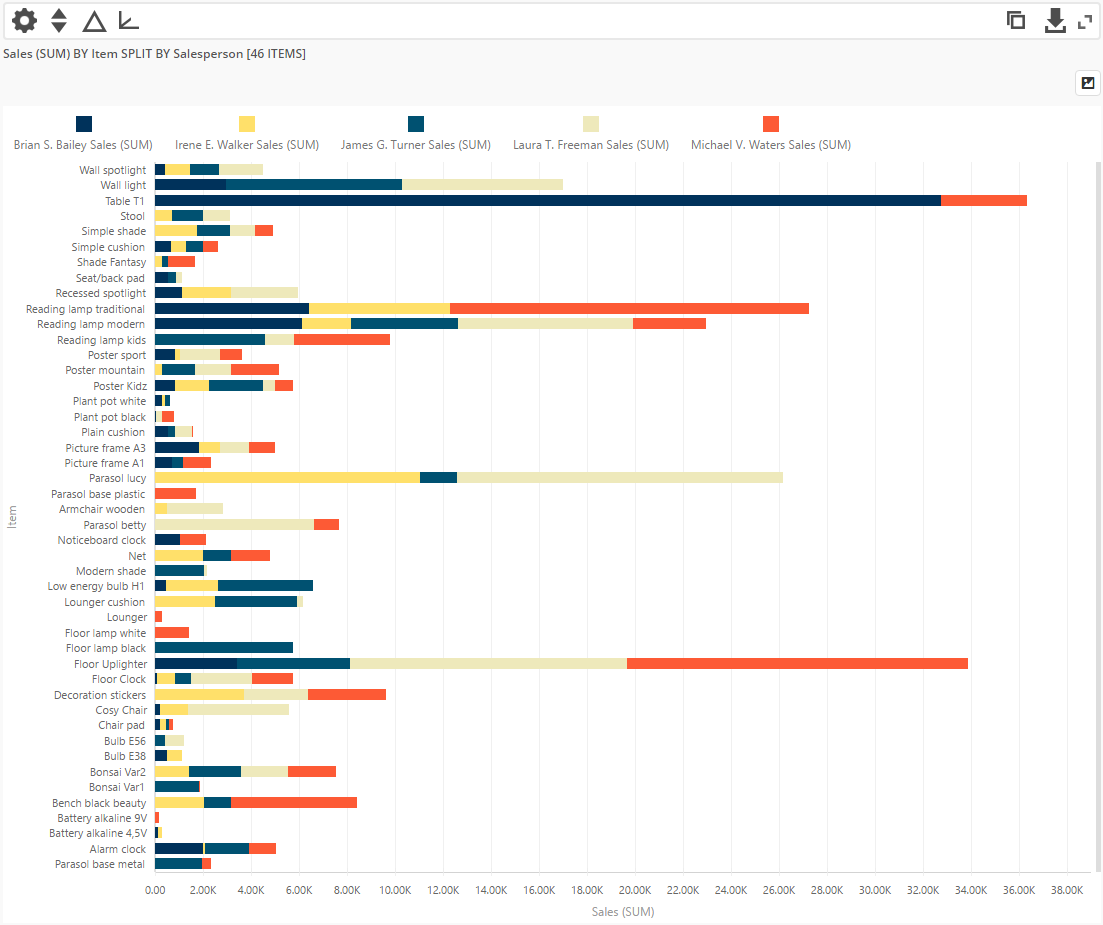
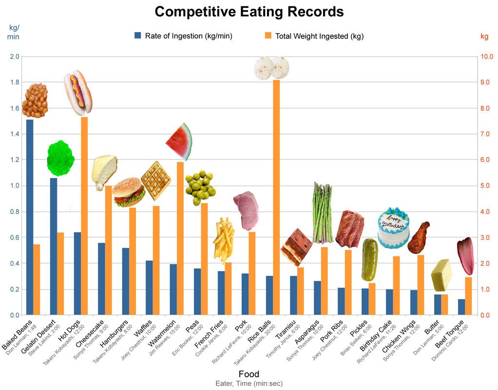
If we imagine a cafe that wants to map the changing preference of customers by recording how much each item on the menu is ordered, it will require a bar graph to have more than one bar (one bar for each item on the menu) per variable (time). Here you might use color and/or texture to differentiate each bars to specify which item on the menu they correspond to: in other words, color code it. This information would be listed on a legend next to the bar graph.
Other Forms of Bar Graphs
A typical format for a bar graph is a flat, two dimensional chart. An extension of this basic structure is a stacked bar graph which allows to compare more than one series of data. A number of bars are stacked on top of each other instead of being put side by side and as a whole form one large bar. Although it allows you to compare different parts of the bar to the whole, it isn't representing a proportional value like a pie chart.
Histograms
Histograms look like bar graphs and share similar features: use bars to display data, and has an x-axis and y-axis. However it differs from a bar graph in terms of the type of data it represents. A histogram can only represent numerical data with a corresponding numerical value but a bar graph represents categorical information that has a corresponding numerical value. A histogram has the ability to show the full range of numerical data and see how they are distributed—it requires to have a set of consecutive data points to graph, which is another factor that differentiates the look of a histogram to a regular bar graph; in a histogram the bars are tightly packed to each other with no space in between, while a bar graph has space in between the bars. This is why a histogram needs additional calculations to graph the numerical data (because it doesn't intend to show the absolute value of the data). The steps are the following:
1) Find the range of the numerical data (R) by subtracting the smallest value from the largest value.
2) Divide the range by the number of bars (B) you want to have.
3) The number you get from 2) is value range for each bar you will draw. Adjust the value so that it is a convenient number to work with.
4) Draw the y-axis plotted with a numerical scale.
5) For each data mark off one count above the appropriate bar.
Use of Color and Labels
Organizing Multiple Series of Data
Basic Rules of A Bar Graph
Sources: Examples Above
BAD 01
https://www.behance.net/gallery/107583021/Data-Comparison?tracking_source=search_projects_recommended|bar graph
GOOD 01
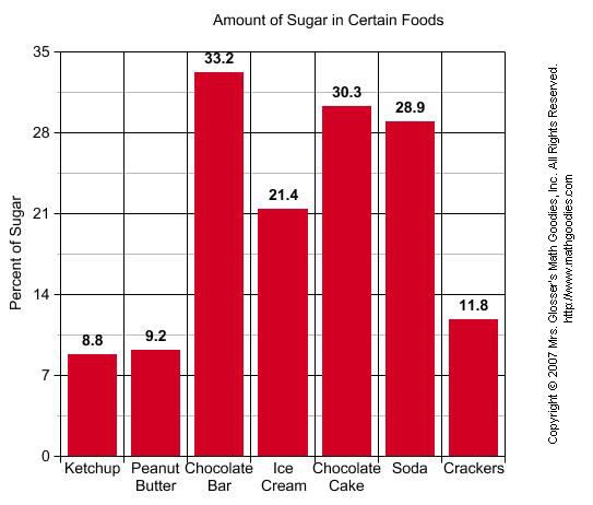
https://www.mathgoodies.com/lessons/graphs/bar_graph
BAD 02
http://www.databoxdigital.com/2014/05/01/choosing-graph-types/
GOOD 02
https://www.pinterest.com/pin/109423465922611479/
BAD 03
https://peltiertech.com/bad-bar-chart-practices-or-send-in-the-clowns/
GOOD 03
https://www.pythoncharts.com/matplotlib/beautiful-bar-charts-matplotlib/
Other Sources for This Post
 Hrvoje Smolic