Who are they?
Created in 1973 by Herman Chernoff, this data visualization system allows multiple variables to be displayed at once. This whimsical system may challenge our understanding and possibly preconceived ideas of what a dataset can look like. Variables are represented by facial features on a caricature of an individual. Perhaps a fun substitute to the classic bar, line, and circle graph, Chernoff faces attempts to incorporate a personal touch to stale geometric numbers and shapes. Created based on the assumption that we, as humans, can easily recognize and read each others’ faces; therefore, we, as data consumers, should be able to recognize the small differences when these features represent diverse variables.
How do they work?
Condensing and organizing the data into categories, each feature on the face will visually represent a category. The range of variables within each category can be differentiated by the size, position, or color of the facial feature. For example, one could indicate pupil size to indicate the range of data for how many times it has snowed in a week. If the pupil is larger, it might indicate that it has snowed more frequently, the precise numeric data can be clarified in a legend, while a smaller pupil might represent less snowfall.

The type of data Chernoff faces can display are quite varied, anything from a range to precise observations. There isn’t too much limitation to the variety of data these faces can visualize, as long as there is a category associated with a facial feature then it can most likely be visually displayed.
There are many different combinations when designing a Chernoff face, which is why organization for this visual representation system is quite imperative. Legends are also essential when defining what each facial feature will represent. Because it is a visual system, it is important to clearly label and categorize to reduce the risk of visual pollution and encourage succinct communication.
Advantages?
Visual comparison. The advantages of Chernoff faces are their quick and accurate depictions of comparative data. Each data or variable does not need to be compared to its counterparts in the same category, as Chernoff faces provide an overall image for quick visual comparisons. Chernoff faces are also easily compared without reading or comprehending numbers, letters, coordinates, etc. They predominantly focus on the distinct visual differences between the illustrated faces rather than numeric differences. These visual representations, varying in shape, position, color, and more, can make spotting differences in data immediate and accessible. In addition, the concept of pareidolia accentuates the favorability that humans have with faces. The concept of pareidolia is the tendency to perceive a stimulus as an object known to the observer, in other words we tend to see faces and patterns in inanimate objects or hear hidden messages in audios. This makes Chernoff faces more exciting and intriguing compared to the longstanding datasets we’ve grown accustomed to in our basic statistics courses.
Disadvantages?
Although Chernoff faces were created based on the assumption that humans can easily detect minute differences in facial expressions, these illustrations for data representation are more challenging to read than a friend’s outward emotions. With seemingly endless variations and representations of facial features, Chernoff faces can become challenging to understand. Elements of these features (position, size, color, shape, etc.) can become muddled and visually overwhelming. There can be various categories to be aware of when reading and comparing the faces. Too many and they can alter the appearance of the faces, sometimes creating unwanted attention towards a particular variable. As social creatures, we also tend to focus on the emotions of inanimate faces, such as reading a Chernoff face as “sad” and negatively connotated because of the downward slope of the “mouth”. Reading faces can also lead to unintentional stereotyping and distortions in a caricature, especially when they are representing groups of people or a specific individual. There is also the controversy that Chernoff faces can misrepresent a “race” by utilizing visual stereotypes and data associated with a certain group of people. It does boil down to an individual’s interpretation of these faces emphasizing the subjectivity connected with human faces/expressions. Chernoff faces also have the disadvantage of personal hierarchy, as individuals tend to have their own hierarchy when identifying a face, some features are more prominent and visible to others than to ourselves. While we can recognize faces quickly, effectively differentiating and comparing features is much more difficult than Herman Chernoff theorized.
Good (or 'decent') Examples

· Fig 1: depicts a "good" example of a Chernoff face because of its clear incorporation of map and faces without visually muddling the data. Overall, it is reasonably understandable due to the simplistic variations in facial features with clarification and context in the legend placed in the bottom left.

· Fig 2: depicts a "good" example of a Chernoff face key or legend, it thoroughly organizes the facial differences into categories and clearly marks the range of data it represents

· Fig 3: depicts a "good" example of a Chernoff face because there is clear separation of legend, variables and facial features, as well as labeling the participants in the study (my only suggestion would be the addition of color to accentuate further clarity of categories)
Bad Examples
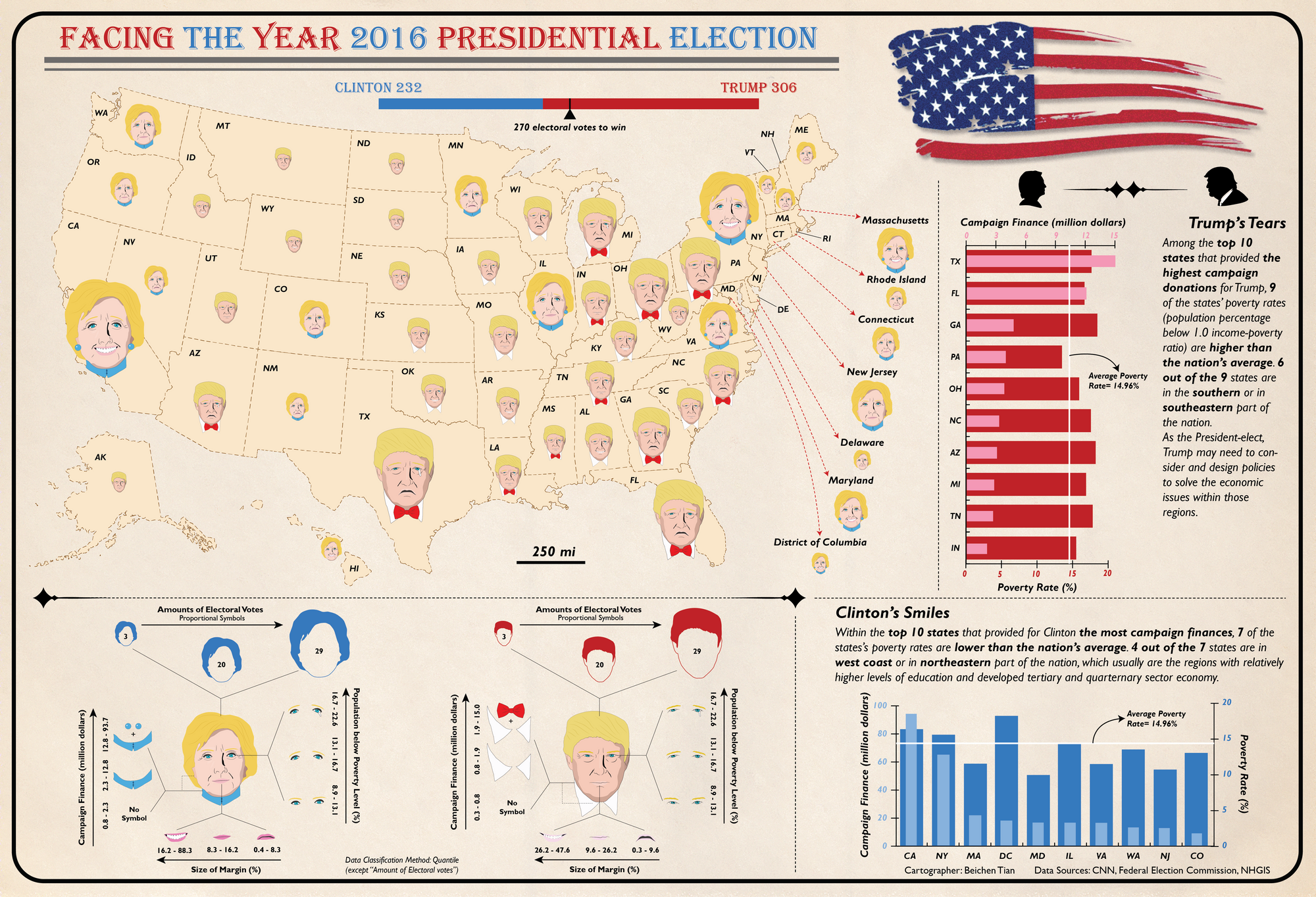
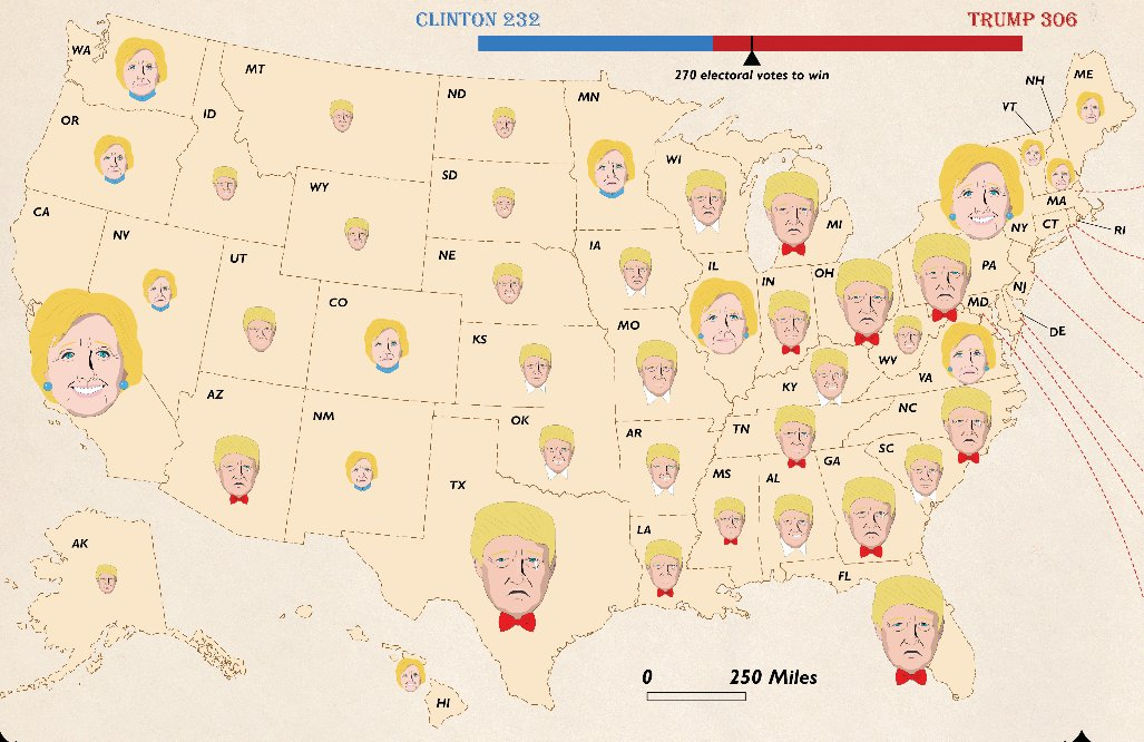
· Fig 4: depicts a "bad" example of Chernoff faces because of the lack of clarity. The legend is difficult to understand, the changes in facial expressions are very subtle, the pairing of the map and faces is visually overwhelming, and Trump's tears makes it seem as if it is negatively connotated and he lost all those states...also they are portrayed with similar skin tones, and we all know what color his should be

· Fig 5: depicts a "bad" example of Chernoff faces because it is so convoluted and confusing! There is little to no variation in the facial features and the size of the map and counties makes it seem overcrowded and constricted.

· Fig 6: depicts a "bad" example of Chernoff faces because, well, a graph AND faces? I'm not even sure where to start with this critique.
Resources
https://eagereyes.org/criticism/chernoff-faces
https://flowingdata.com/2010/08/31/how-to-visualize-data-with-cartoonish-faces/