Parallel-Coordinate Plots
What are they?
Parallel coordinate plots visualize multiple factors and, more importantly, show their relationships to one another. Each variable is given its own vertical axis, and the values for each variable is typically represented as an integer that falls along the vertical axis for said variables. Commonly the variables that are most related move from right to left to demonstrate relationships between them more easily given Western cultures read from right to left.
When they work best
Parallel-coordinate plots work best for showing the relationships between multiple variables. It's important to arrange the vertical axis in such a way that they clearly show the relationships between variables and the effects of the variables have on the values assigned to what is being measured.
Downsides
If too many 'items' are being measured by the variables, the visualization can quickly become cluttered and difficult to read and identify the key findings. The best way way to address this downside is using a technique called "brushing" where a key line or series of lines are highlighted and the surrounding lines are faded into the background. This allows the viewer to isolate the sections and plots that matter the most.
Bad Examples
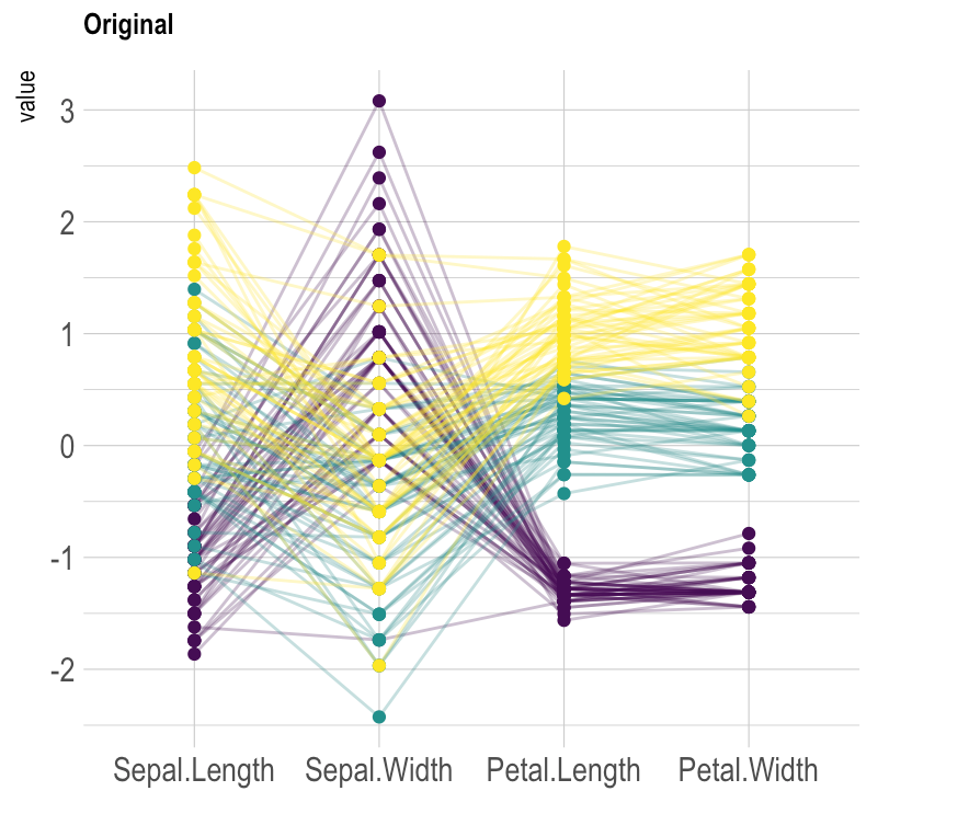
Figure 1: This is parallel-coordinate plot could be better. In this example, the vertical axis are ordered in such a way that it's more difficult to see subsequent relationships since the middle axis convolutes the interpretation of the relationships between one another.
Source: https://www.data-to-viz.com/graph/parallel.html
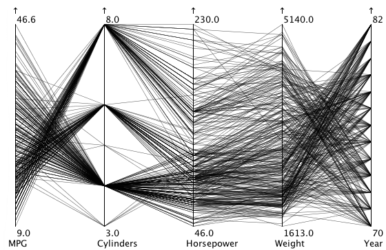
Figure 2: Given the absence of color or other labels in this parallel coordinate plot, it's impossible identify the different models or separate singular lines from one another. This plot suffers from clutter and cannot be read or establish what 'items' are which as they move along the visualization.
Source: https://eagereyes.org/techniques/parallel-coordinates
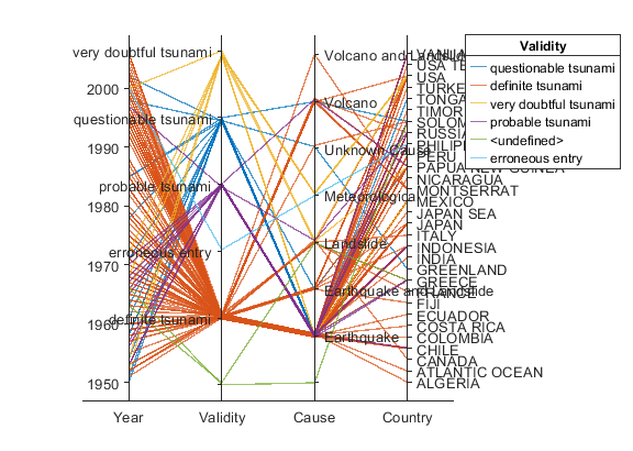
Figure 3: This parallel-coordinate plot suffers from trying to measure too many 'items,' in this case, countries. It is impossible to identify which line easily corresponds to which country and the natural disasters that occurred in the given year.
Source: https://www.mathworks.com/help/matlab/ref/parallelplot.html
Good Examples
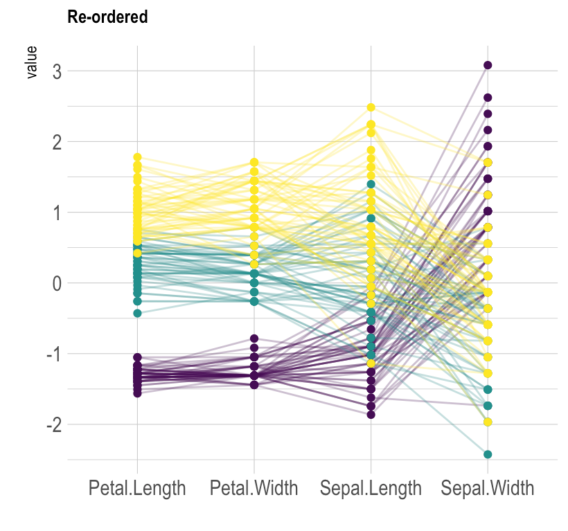
Figure 4 is the same information as Figure 1, however, the vertical axises have been rearranged to better read from left to right and understand the relationships between the axises being analyzed.
Source: https://www.data-to-viz.com/graph/parallel.html
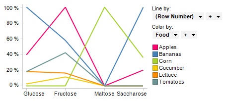
Figure 5 is relatively clear. Though there is some overlapping points, there are few enough lines to easily identify which color corresponds to which produce and which type and amount of carbohydrate they contain.
Source: https://docs.tibco.com/pub/spotfire/6.5.0/doc/html/para/para_what_is_a_parallel_coordinate_plot.htm
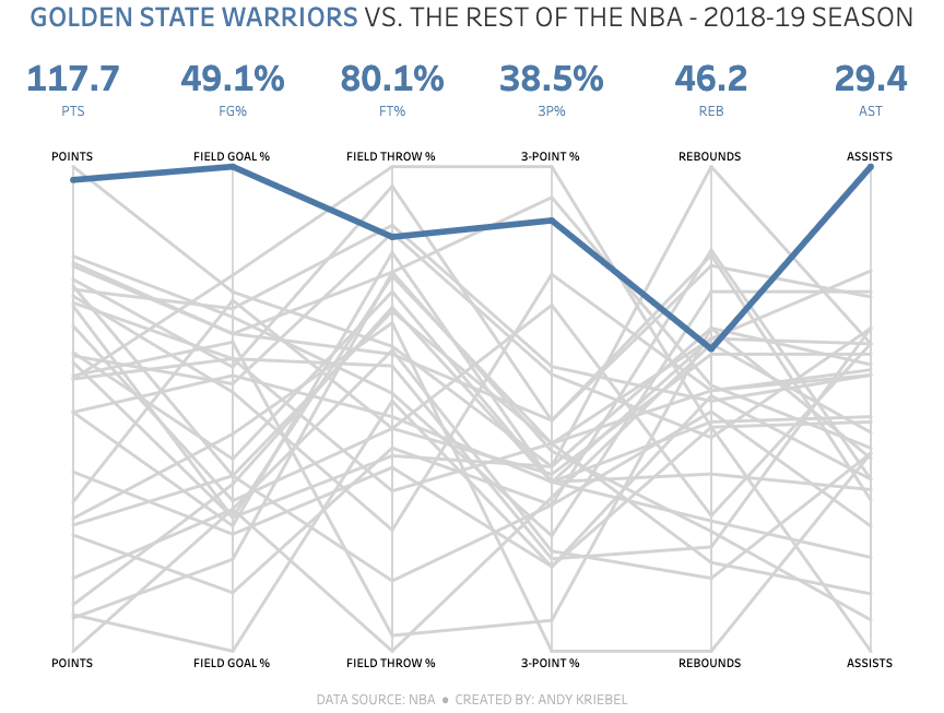
Figure 6 addresses the issue of clutter very well. It pulls out the key line apart from the others using color to help the viewer identify which is the key line being measured. However, without data labels, a viewer must look to the top of the graph in order to understand what each of the data points represents numerically.
Source: https://www.vizwiz.com/2019/07/parallel-coordinates.html
Star Plots
What are they?
Star plots are a type of visualization that, similar to parallel-coordinate plots, measure multiple variables and allow the viewer to see the relationships between the points being measured and represented. They are called star plots specifically because as the points radiate from the center, similar to how a star's points move outwards from a central locus.
When they work best
A star plot works best for identifying outliers in relationships and when the data is more similar/consistent with other relationships.
Downsides
The primary downside of a star plot is the number of variables that can be visualized. Once too many variables are being measured, it can become increasingly challenging to identify the relationships between them.
Bad Examples
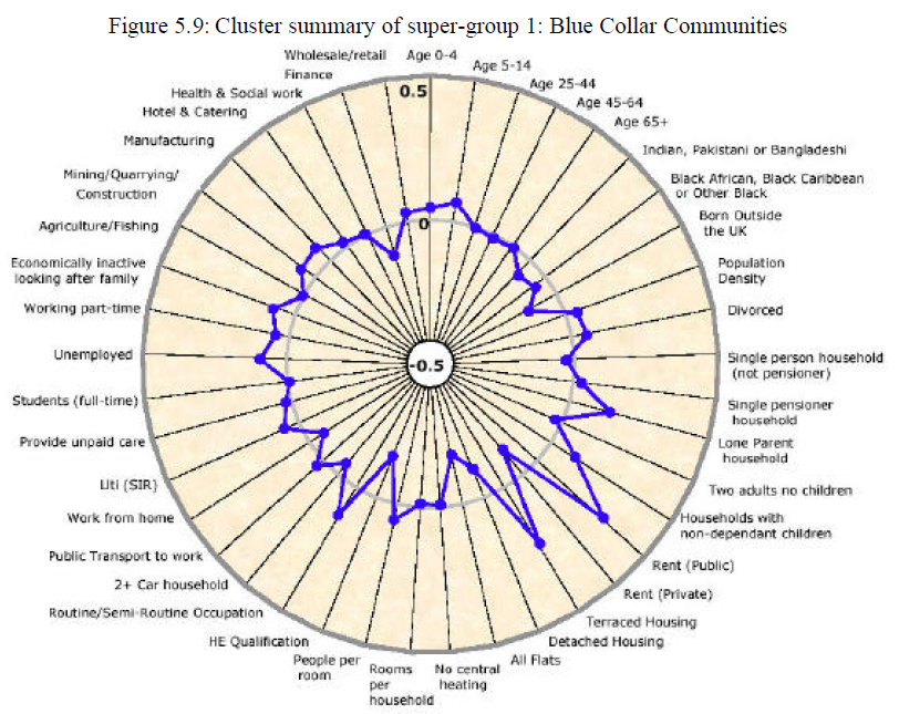
Figure 7 is trying to measure too many variables along the outside of the plot. Given the number of variables being measured, it's more challenging to see the minute relationships between the points. However, in this figure, it is easier to see the 'outliers' but almost impossible to read the smaller details in that aren't those specific outliers.
Source: http://rstudio-pubs-static.s3.amazonaws.com/5795_e6e6411731bb4f1b9cc7eb49499c2082.html
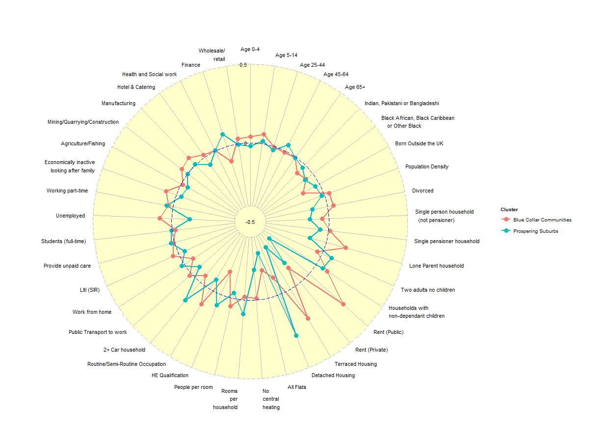
Similar to Figure 7, Figure 8 is also measuring too many variables. Though it is only measuring 2 'items' (in this case, Blue Collar Communities vs. Prospering Suburbs) it is very challenging to see what the relationships are in the variables.
Source: http://rstudio-pubs-static.s3.amazonaws.com/5795_e6e6411731bb4f1b9cc7eb49499c2082.html
Good Examples
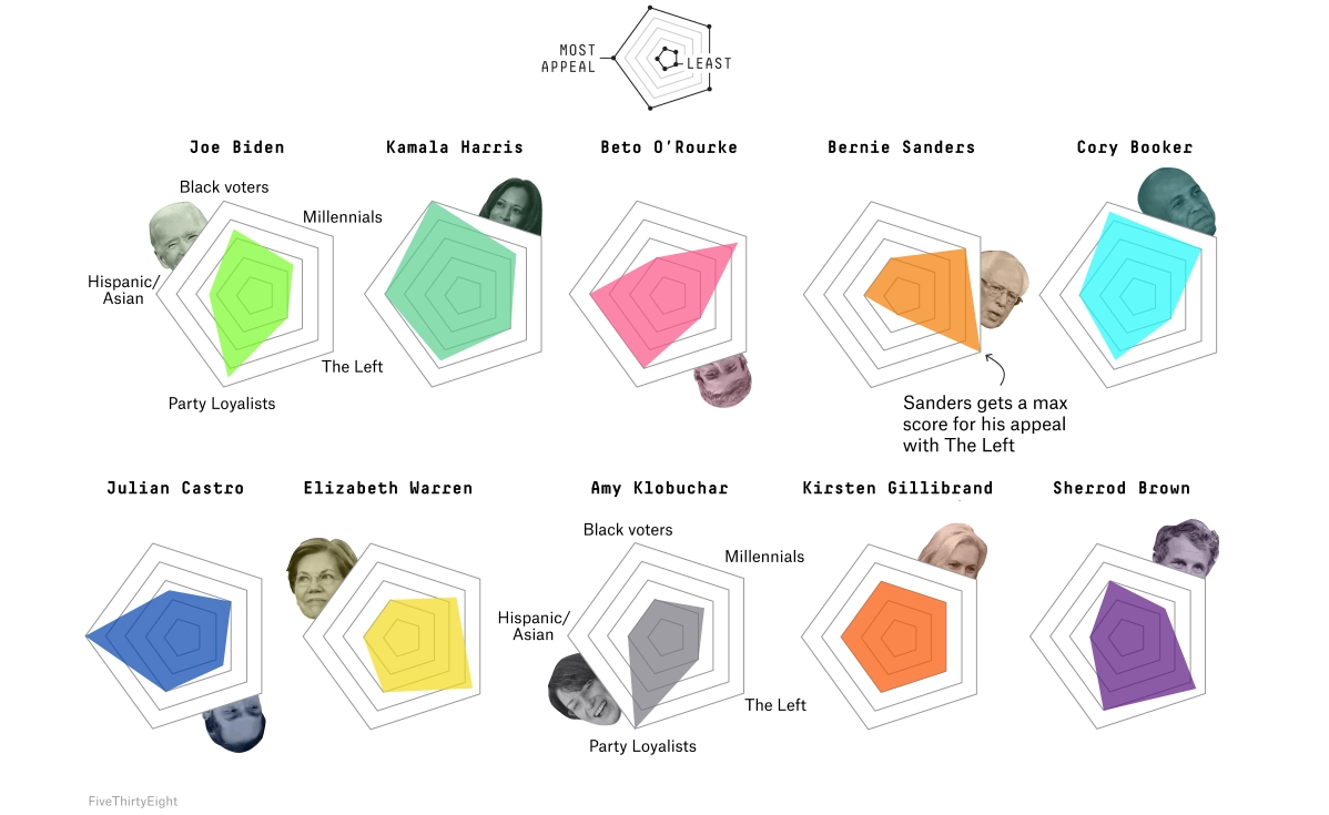
Interestingly enough with Figure 9, it's focusing on the relationships between the points of the pentagons instead of demonstrating the numbers themselves. In this sense, without statistical data, it is actually easier to 'read' the relationships of the different points on the pentagons
Source: https://fivethirtyeight.com/features/the-5-key-constituencies-of-the-2020-democratic-primary/
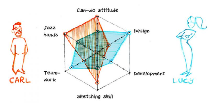
Similar to Figure 9, Figure 10 does not focus on numerical data but again focuses on the relationships of the points on the char and how the two 'items' (Carl and Lucy) compare to one another. The two items being measured and limited number of axis make this a good example of a star plot.