By In Seok Suh
Physical maps show the natural landscape features of Earth. They are best known for showing topography through colors and shades.
- Darker greens show near-sea-level elevations, with the color grading into tans and browns as elevations increase. The color gradient ends at gray representing the high points of mountain regions.
- Blue colors represent the rivers, lakes, seas and oceans. The shallower water areas are often represented with a lighter blue while darkening in gradient or by intervals for areas of deeper water. Glaciers and ice caps are shown in white colors.
Physical maps may include important political boundaries, such as state and country boundaries for geographic reference and to increase the utility of the map for many users.
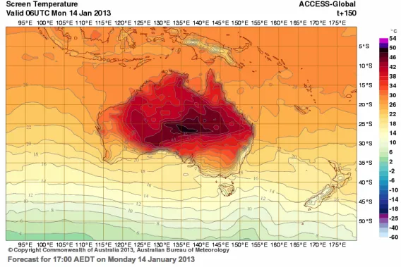
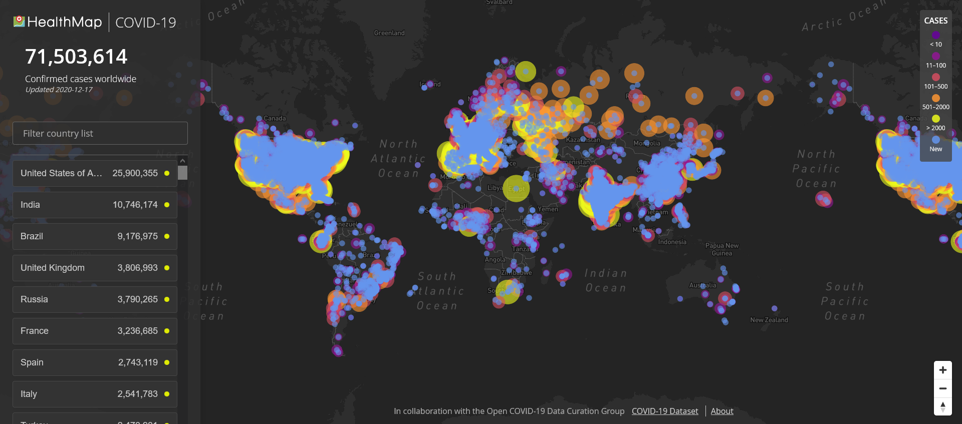
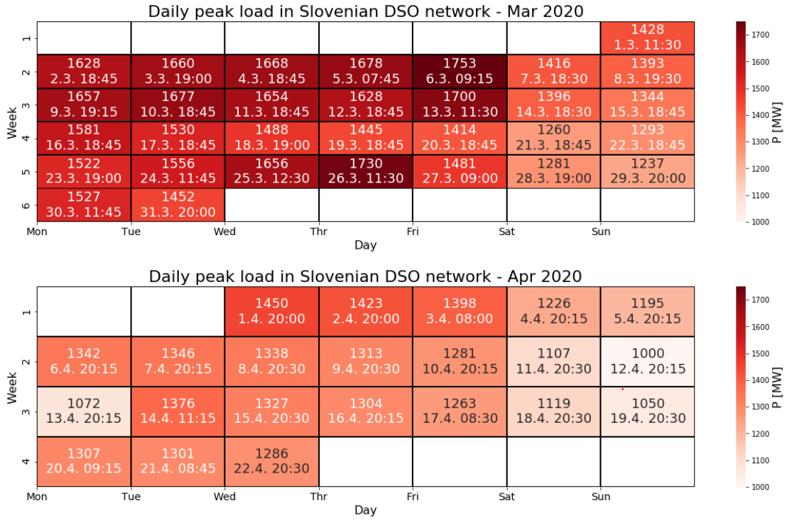
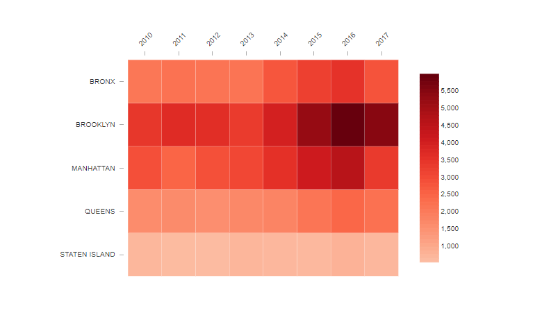
Heat maps show data by using a system of color-coding to represent different values. They can be used to show user behavior on specific webpages. These maps work more visually than standard analytic reports, which can make them easier to analyze at a glance.
- Heat maps are best used with large amounts of data. As heat maps show trends, it is important to have enough information to ensure that any anomalies do not affect the overall heat map picture.
- Heat maps can take the form of a rectangular chart, the cells of which contain numerical data. Or, more commonly in Earth science applications, heat maps are colors overlaid on a map of Earth.

Resources: