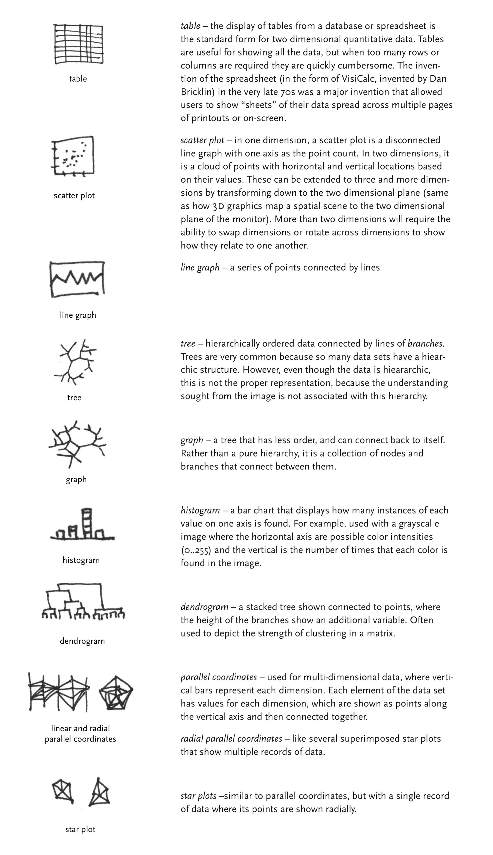
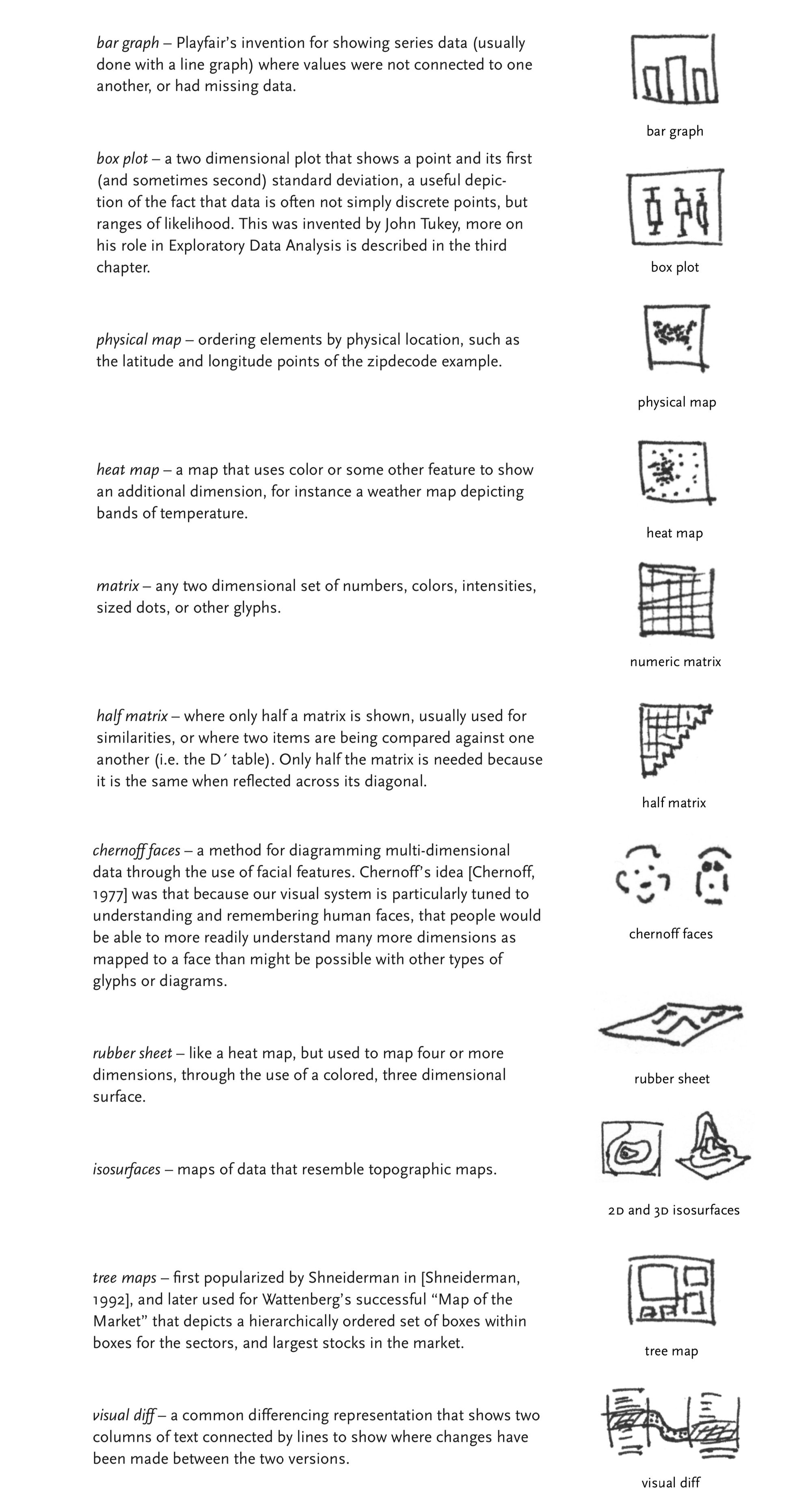
This is a collective research project providing examples and discussion of the basic building blocks of visual data representation.
In his Ph.D. dissertation, information designer Ben Fry assembled a taxonomy of standard visualization types. Look over his list and choose one to research more thoroughly. Sign up for your chosen visualization using this google doc.
Created in 1973 by Herman Chernoff, this data visualization system allows multiple variables to be displayed at once. This whimsical system may challenge our understanding and possibly preconceived ideas of what a dataset can look like. Variables are represented by facial features on a caricature of an individual. Perhaps a fun substitute to the classic bar, line, and circle graph, Chernoff faces attempts to incorporate a personal touch to stale geometric numbers and shapes. Created based on the assumption that we, as humans, can easily recognize and read each others’ faces; therefore, we, as data consumers, should be able to recognize the small differences when these features represent diverse variables.
How do they work?
Condensing and organizing the data into categories, each feature on the face will visually represent a category. The range of variables within each category can be differentiated by the size, position, or color of the facial feature. For example, one could indicate pupil size to indicate the range of data for how many times it has snowed in a week. If the pupil is larger, it might indicate that it has snowed more frequently, the precise numeric data can be clarified in a legend, while a smaller pupil might represent less snowfall.
Possible variations in facial features
The type of data Chernoff faces can display are quite varied, anything from a range to precise observations. There isn’t too much limitation to the variety of data these faces can visualize, as long as there is a category associated with a facial feature then it can most likely be visually displayed.
There are many different combinations when designing a Chernoff face, which is why organization for this visual representation system is quite imperative. Legends are also essential when defining what each facial feature will represent. Because it is a visual system, it is important to clearly label and categorize to reduce the risk of visual pollution and encourage succinct communication.
Advantages?
Visual comparison. The advantages of Chernoff faces are their quick and accurate depictions of comparative data. Each data or variable does not need to be compared to its counterparts in the same category, as Chernoff faces provide an overall image for quick visual comparisons. Chernoff faces are also easily compared without reading or comprehending numbers, letters, coordinates, etc. They predominantly focus on the distinct visual differences between the illustrated faces rather than numeric differences. These visual representations, varying in shape, position, color, and more, can make spotting differences in data immediate and accessible. In addition, the concept of pareidolia accentuates the favorability that humans have with faces. The concept of pareidolia is the tendency to perceive a stimulus as an object known to the observer, in other words we tend to see faces and patterns in inanimate objects or hear hidden messages in audios. This makes Chernoff faces more exciting and intriguing compared to the longstanding datasets we’ve grown accustomed to in our basic statistics courses.
Disadvantages?
Although Chernoff faces were created based on the assumption that humans can easily detect minute differences in facial expressions, these illustrations for data representation are more challenging to read than a friend’s outward emotions. With seemingly endless variations and representations of facial features, Chernoff faces can become challenging to understand. Elements of these features (position, size, color, shape, etc.) can become muddled and visually overwhelming. There can be various categories to be aware of when reading and comparing the faces. Too many and they can alter the appearance of the faces, sometimes creating unwanted attention towards a particular variable. As social creatures, we also tend to focus on the emotions of inanimate faces, such as reading a Chernoff face as “sad” and negatively connotated because of the downward slope of the “mouth”. Reading faces can also lead to unintentional stereotyping and distortions in a caricature, especially when they are representing groups of people or a specific individual. There is also the controversy that Chernoff faces can misrepresent a “race” by utilizing visual stereotypes and data associated with a certain group of people. It does boil down to an individual’s interpretation of these faces emphasizing the subjectivity connected with human faces/expressions. Chernoff faces also have the disadvantage of personal hierarchy, as individuals tend to have their own hierarchy when identifying a face, some features are more prominent and visible to others than to ourselves. While we can recognize faces quickly, effectively differentiating and comparing features is much more difficult than Herman Chernoff theorized.
Good (or 'decent') Examples
(fig 1) Life in Los Angeles — LA Community Analysis Bureau 1971
· Fig 1: depicts a "good" example of a Chernoff face because of its clear incorporation of map and faces without visually muddling the data. Overall, it is reasonably understandable due to the simplistic variations in facial features with clarification and context in the legend placed in the bottom left.
(fig 2) Chernoff Face Legend
· Fig 2: depicts a "good" example of a Chernoff face key or legend, it thoroughly organizes the facial differences into categories and clearly marks the range of data it represents
(fig 3) Chernoff Face Foods
· Fig 3: depicts a "good" example of a Chernoff face because there is clear separation of legend, variables and facial features, as well as labeling the participants in the study (my only suggestion would be the addition of color to accentuate further clarity of categories)
Bad Examples
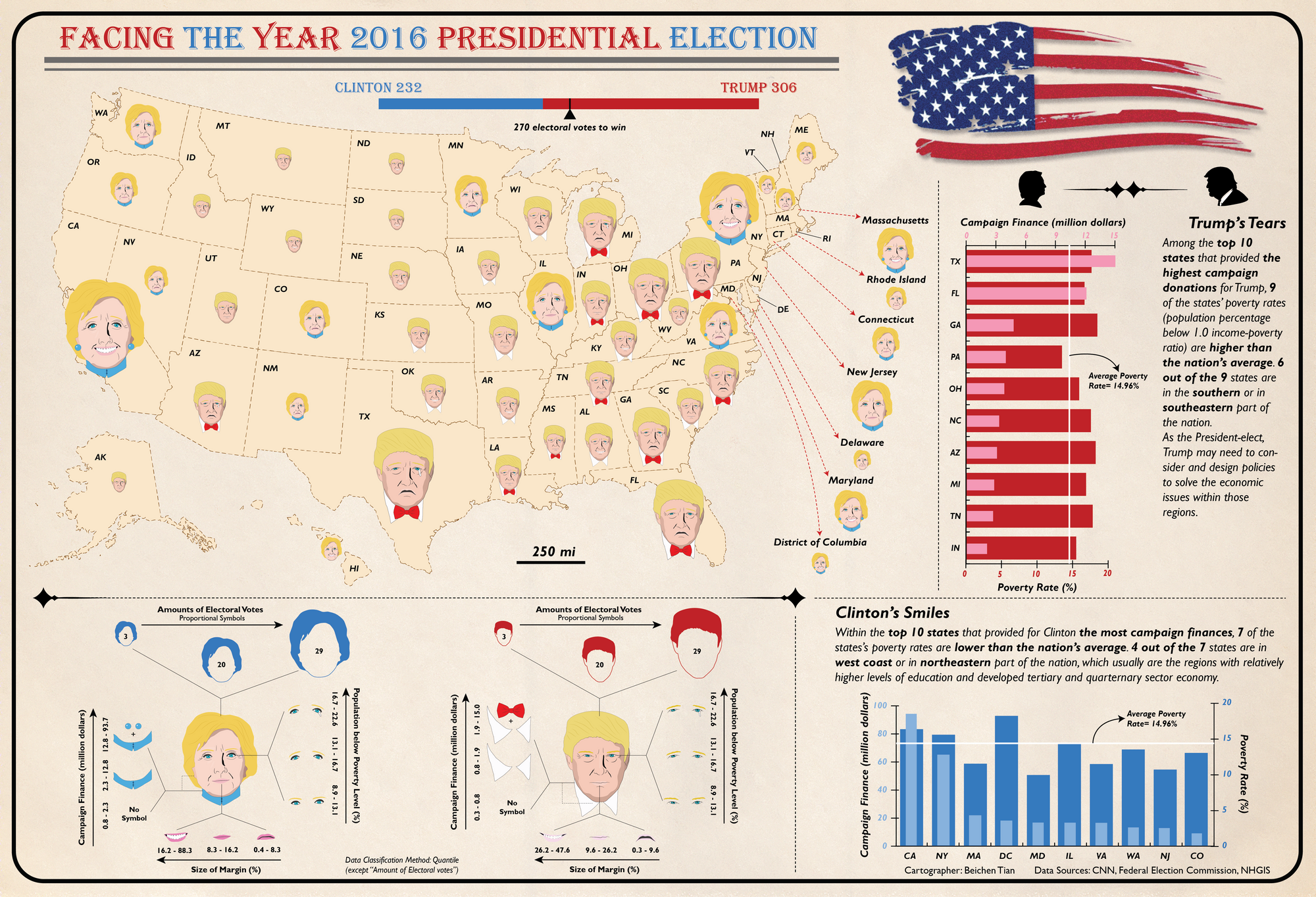
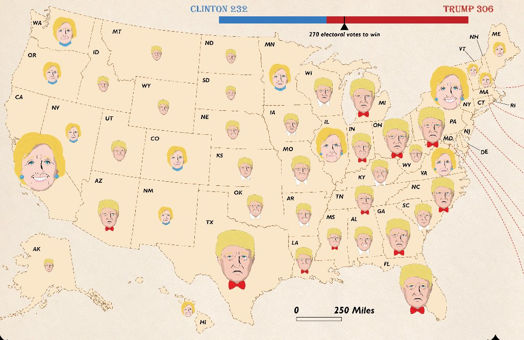
(fig 4) 2016 US Presidential Election as Chernoff Faces
· Fig 4: depicts a "bad" example of Chernoff faces because of the lack of clarity. The legend is difficult to understand, the changes in facial expressions are very subtle, the pairing of the map and faces is visually overwhelming, and Trump's tears makes it seem as if it is negatively connotated and he lost all those states...also they are portrayed with similar skin tones, and we all know what color his should be
(fig 5) Economic Stress and Community Health in Michigan, 2003-07
· Fig 5: depicts a "bad" example of Chernoff faces because it is so convoluted and confusing! There is little to no variation in the facial features and the size of the map and counties makes it seem overcrowded and constricted.
(fig 6) Facial Plots on Four Standardized Social Impact Criteria
· Fig 6: depicts a "bad" example of Chernoff faces because, well, a graph AND faces? I'm not even sure where to start with this critique.
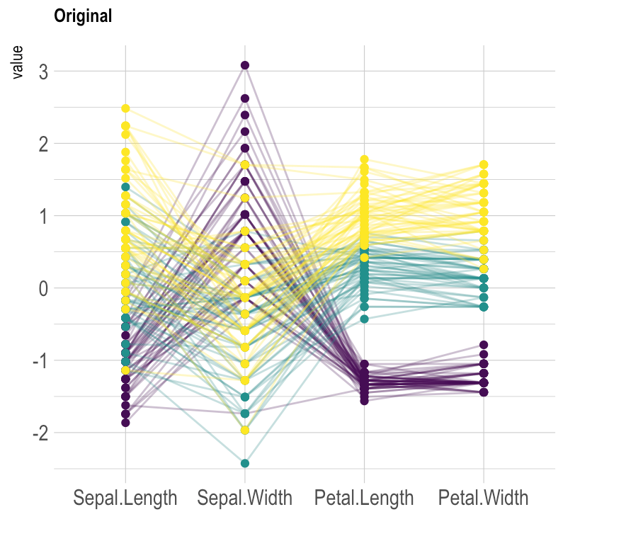
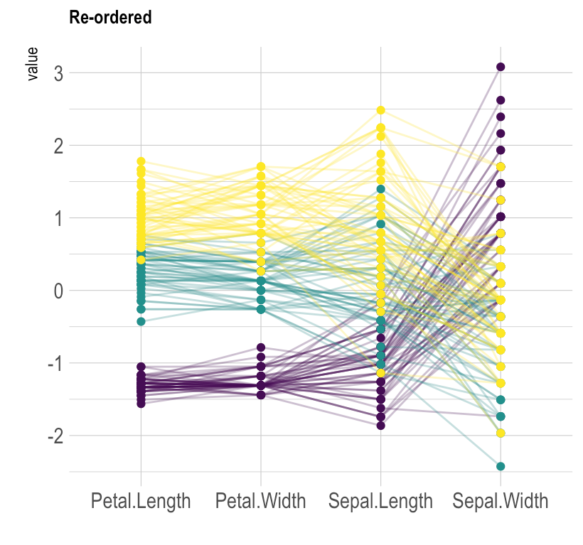
Parallel coordinate plots visualize multiple factors and, more importantly, show their relationships to one another. Each variable is given its own vertical axis, and the values for each variable is typically represented as an integer that falls along the vertical axis for said variables. Commonly the variables that are most related move from right to left to demonstrate relationships between them more easily given Western cultures read from right to left.
When they work best
Parallel-coordinate plots work best for showing the relationships between multiple variables. It's important to arrange the vertical axis in such a way that they clearly show the relationships between variables and the effects of the variables have on the values assigned to what is being measured.
Downsides
If too many 'items' are being measured by the variables, the visualization can quickly become cluttered and difficult to read and identify the key findings. The best way way to address this downside is using a technique called "brushing" where a key line or series of lines are highlighted and the surrounding lines are faded into the background. This allows the viewer to isolate the sections and plots that matter the most.
Bad Examples
Figure 1: Relationships of sizes of parts of a flower
Figure 1: This is parallel-coordinate plot could be better. In this example, the vertical axis are ordered in such a way that it's more difficult to see subsequent relationships since the middle axis convolutes the interpretation of the relationships between one another.
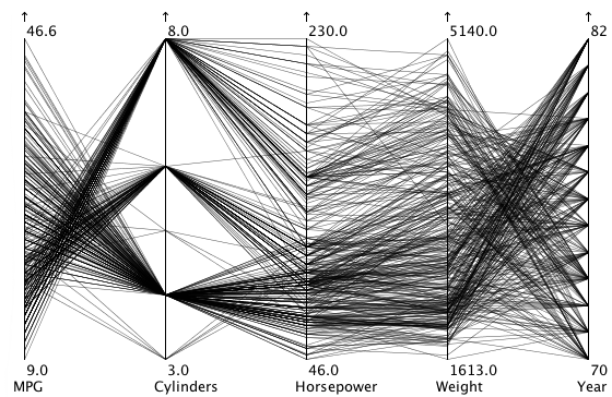
Figure 2: Metrics of car models released from 1970 to 1982,
Figure 2: Given the absence of color or other labels in this parallel coordinate plot, it's impossible identify the different models or separate singular lines from one another. This plot suffers from clutter and cannot be read or establish what 'items' are which as they move along the visualization.
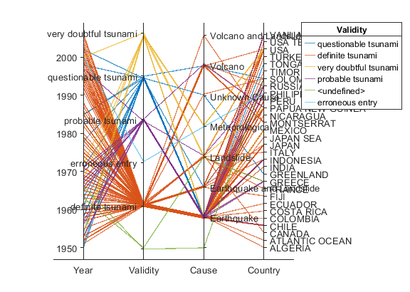
Figure 3: Occurrences of natural disaster by country and cause
Figure 3: This parallel-coordinate plot suffers from trying to measure too many 'items,' in this case, countries. It is impossible to identify which line easily corresponds to which country and the natural disasters that occurred in the given year.
Figure 4: Relationships of sizes of parts of a flower
Figure 4 is the same information as Figure 1, however, the vertical axises have been rearranged to better read from left to right and understand the relationships between the axises being analyzed.
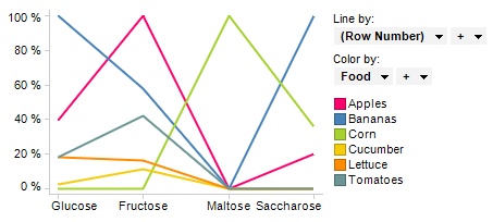
Figure 5 is relatively clear. Though there is some overlapping points, there are few enough lines to easily identify which color corresponds to which produce and which type and amount of carbohydrate they contain.
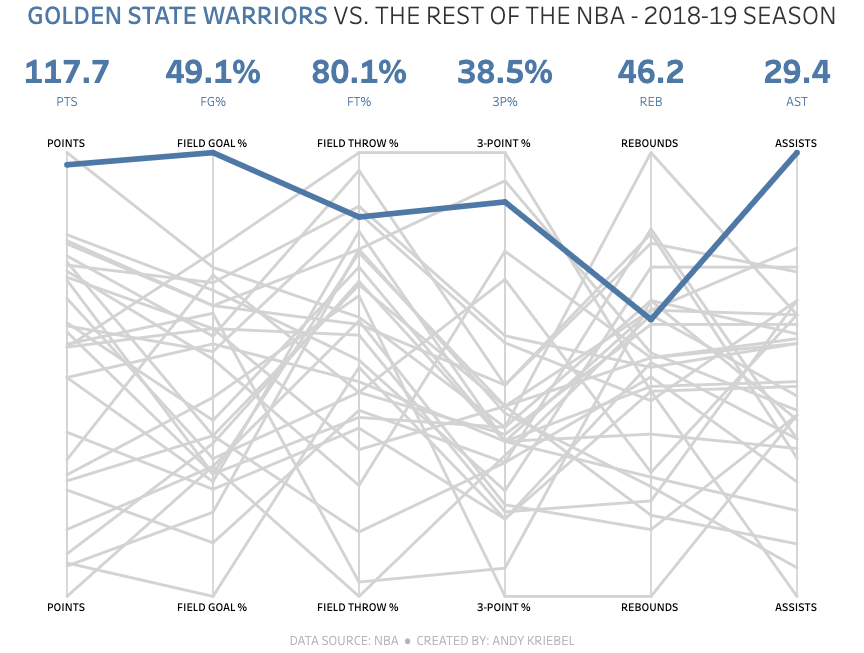
Figure 6: Golden State Warriors vs. the rest of the NBA 2018-19 SEASON
Figure 6 addresses the issue of clutter very well. It pulls out the key line apart from the others using color to help the viewer identify which is the key line being measured. However, without data labels, a viewer must look to the top of the graph in order to understand what each of the data points represents numerically.
Star plots are a type of visualization that, similar to parallel-coordinate plots, measure multiple variables and allow the viewer to see the relationships between the points being measured and represented. They are called star plots specifically because as the points radiate from the center, similar to how a star's points move outwards from a central locus.
When they work best
A star plot works best for identifying outliers in relationships and when the data is more similar/consistent with other relationships.
Downsides
The primary downside of a star plot is the number of variables that can be visualized. Once too many variables are being measured, it can become increasingly challenging to identify the relationships between them.
Bad Examples
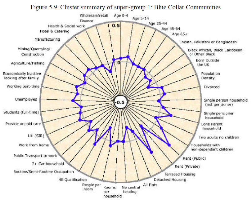
Figure 7: Cluster summary of super-group 1: Blue Collar Communities
Figure 7 is trying to measure too many variables along the outside of the plot. Given the number of variables being measured, it's more challenging to see the minute relationships between the points. However, in this figure, it is easier to see the 'outliers' but almost impossible to read the smaller details in that aren't those specific outliers.
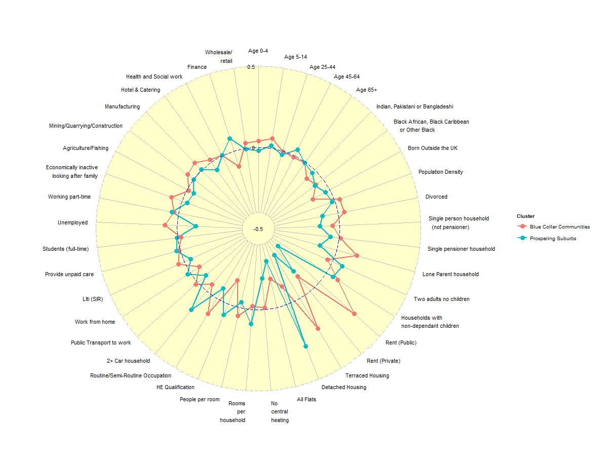
Figure 8: Cluster of Communities and their key metrics
Similar to Figure 7, Figure 8 is also measuring too many variables. Though it is only measuring 2 'items' (in this case, Blue Collar Communities vs. Prospering Suburbs) it is very challenging to see what the relationships are in the variables.
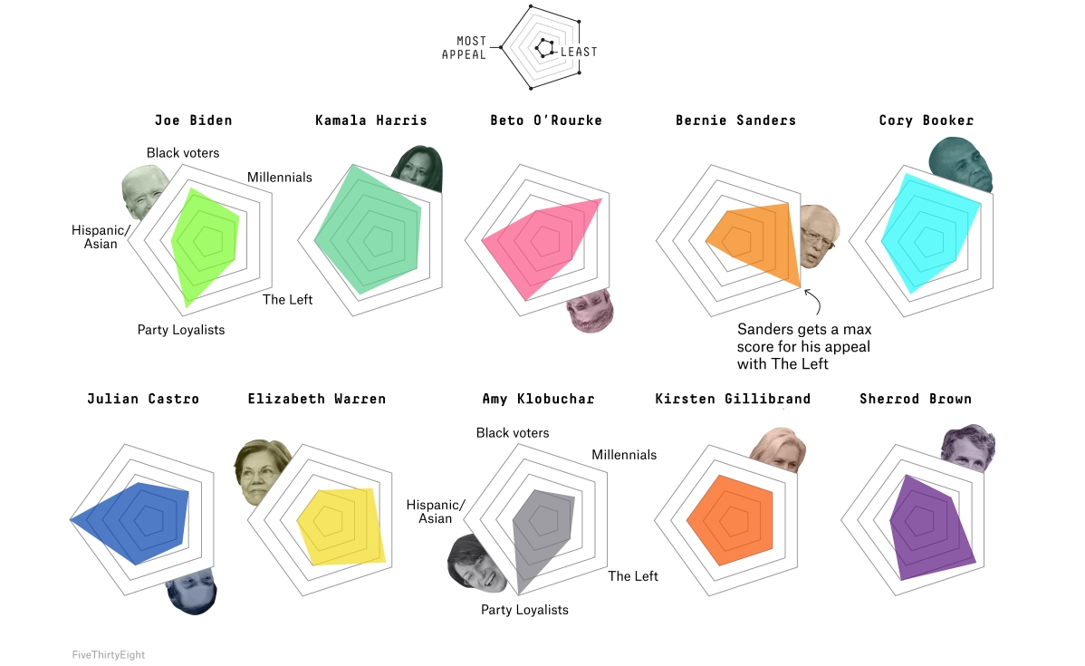
Figure 9: 2020 Democratic Contenders with the 5 corners of the Democratic Party
Interestingly enough with Figure 9, it's focusing on the relationships between the points of the pentagons instead of demonstrating the numbers themselves. In this sense, without statistical data, it is actually easier to 'read' the relationships of the different points on the pentagons
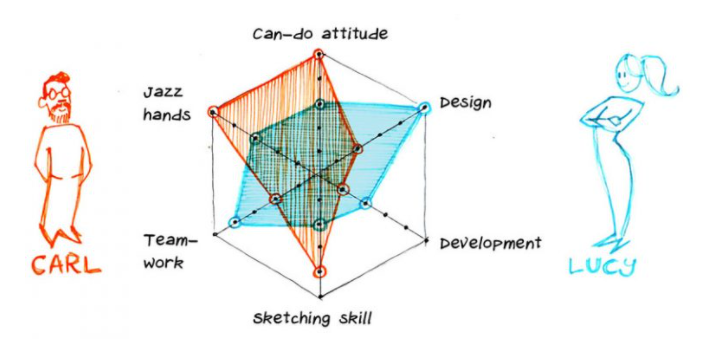
Figure 10: Skills and overall abilities of Lucy vs. Carl
Similar to Figure 9, Figure 10 does not focus on numerical data but again focuses on the relationships of the points on the char and how the two 'items' (Carl and Lucy) compare to one another. The two items being measured and limited number of axis make this a good example of a star plot.
I wanted to start by writing down some initial thoughts, understandings, and observations on a bar graph.
Breaking it down to a bar + a graph.
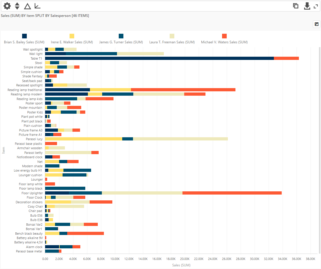
The bar represents data which has been visually translated into a graphic form—a rectangle bar. The graph is the underlying system that allows the data to be examined as a group in which people are able to draw out various insights. Putting them together, my short definition of a bar graph would be the following: a visual system that represents a set of data using bars. It is one of the most familiar and intuitive type of graphs we easily find in a daily-life setting: we can find bar graphs being used to show survey results and bank statements.
The dictionary definition of a bar graph is a diagram in which the numerical values of variables are represented by the height or length of lines or rectangles of equal width along both an x-axis and y-axis. One thing that is fascinating about a bar graphs is that the value that a bar graph represents is numerical values. This allows a bar graph to have a very generous band width in representing values ranging from fractions to integers and percentages. Although some may be more clearly represented in other types of graphs, a bar graph is able to cover the general realm of data that takes the form of numbers.
When do you want to use bar graphs?
A bar graph is an effective tool to visualize a process and make comparisons on a group of data. It is easy to recognize a change or identify a difference between them as the bars are presented side by side. I think bar graphs are most powerful when it is representing a single subject matter (one group of data), numerical scale, and variable. As an example, a bar graph would work perfectly when I want to visualize my daily expenses of last week (subject matter). I would have only one category for the variable (different days of the week) to plot on my x-axis and only one numerical scale (dollars) to plot on my y-axis. But if I were to alter the subject matter to be my family's individual expenses and sleeping hours during that week, I would now have two groups of data and facing two or more numerical scales, variables, and a considerably larger amount of bars which makes it trickier to plot and draw on the graph as well as analyzing it afterwards.
In the most ideal scenario where the subject matter, numerical value, and variable are clear, a bar graph doesn't need to further calculate the raw data. The only thing to make sure is to plot an evenly distanced numerical scale and properly translate the numerical value into the size (height or width) of the bars—since the length of a bar displays an absolute value (raw data), you do not need additional calculations.
If we imagine a cafe that wants to map the changing preference of customers by recording how much each item on the menu is ordered, it will require a bar graph to have more than one bar (one bar for each item on the menu) per variable (time). Here you might use color and/or texture to differentiate each bars to specify which item on the menu they correspond to: in other words, color code it. This information would be listed on a legend next to the bar graph.
Other Forms of Bar Graphs
A typical format for a bar graph is a flat, two dimensional chart. An extension of this basic structure is a stacked bar graph which allows to compare more than one series of data. A number of bars are stacked on top of each other instead of being put side by side and as a whole form one large bar. Although it allows you to compare different parts of the bar to the whole, it isn't representing a proportional value like a pie chart.
Histograms
Histograms look like bar graphs and share similar features: use bars to display data, and has an x-axis and y-axis. However it differs from a bar graph in terms of the type of data it represents. A histogram can only represent numerical data with a corresponding numerical value but a bar graph represents categorical information that has a corresponding numerical value. A histogram has the ability to show the full range of numerical data and see how they are distributed—it requires to have a set of consecutive data points to graph, which is another factor that differentiates the look of a histogram to a regular bar graph; in a histogram the bars are tightly packed to each other with no space in between, while a bar graph has space in between the bars. This is why a histogram needs additional calculations to graph the numerical data (because it doesn't intend to show the absolute value of the data). The steps are the following:
1) Find the range of the numerical data (R) by subtracting the smallest value from the largest value. 2) Divide the range by the number of bars (B) you want to have. 3) The number you get from 2) is value range for each bar you will draw. Adjust the value so that it is a convenient number to work with. 4) Draw the y-axis plotted with a numerical scale. 5) For each data mark off one count above the appropriate bar.
Use of Color and Labels
BAD 01—Everything is a bit vague. It's hard to understand what the different shades of purple and blue represents. Also it doesn't label what the x and y-axis stands for. GOOD 01—Everything is correctly labeled and doesn't use color to overly characterize the bars.
Organizing Multiple Series of Data
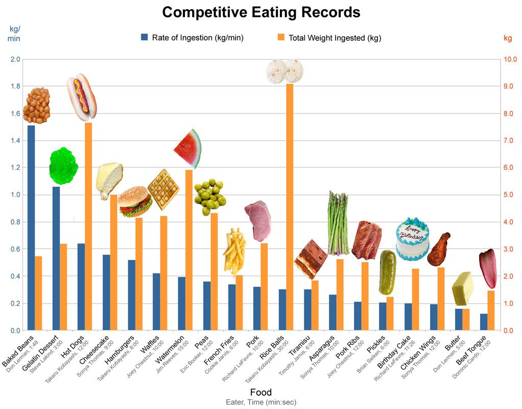
BAD 02—There is too much information scattered! Here, we can see that there are four different data series to show over the change of time, however it isn't using the x-axis to label the different years. The current setting forces the bar graph to use 11 different colors. GOOD 02—A great example of showing three series of data in a traditional 2 dimensional bar graph. The data isn't cluttered together and packed in with a variety of colors like the example above. Separating the two types of numerical scales on the left and right made it easier to understand what series of data the colors are referring to. Maybe the images are a stretch, but I think these visual aids suits their purpose and interests the viewers.
Basic Rules of A Bar Graph
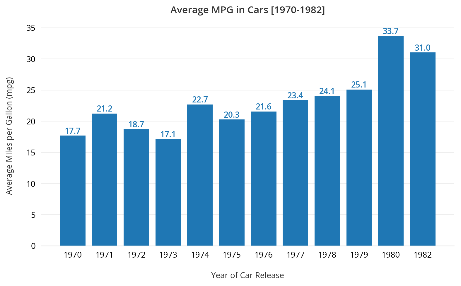
BAD 03—The colors are not used to differentiate series of data but to intentionally emphasize a certain value, presenting a biased opinion. Also the width of the bars are unequal which makes it harder to identify their value against the y-axis. Finally the bar extends beyond the range of its assigned country which makes it impossible to comprehend what the value is actually representing.GOOD 03—Simple, clean, and effective. The labels, use of color, and bars are all presented with constraint (reading as an organized/unified whole) which makes it easier to identify the changes in the average MPG in cars over time. The numbers that show the exact value is a great touch that adds clarity to the information.
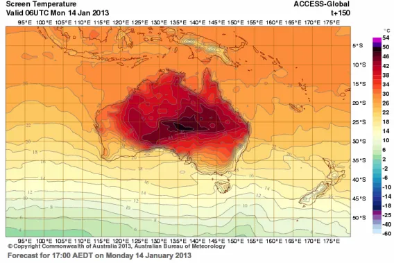
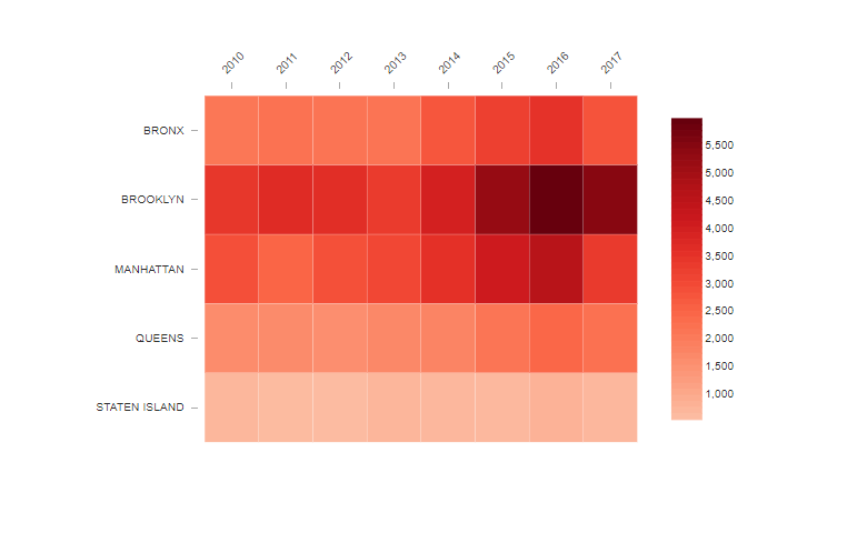
Three different examples of proper physical and heat maps. The first two examples incorporate a combination of physical and heat maps, while the third example is a heat map that is displayed on a rectangular chart.
Physical maps show the natural landscape features of Earth. They are best known for showing topography through colors and shades.
Darker greens show near-sea-level elevations, with the color grading into tans and browns as elevations increase. The color gradient ends at gray representing the high points of mountain regions.
Blue colors represent the rivers, lakes, seas and oceans. The shallower water areas are often represented with a lighter blue while darkening in gradient or by intervals for areas of deeper water. Glaciers and ice caps are shown in white colors.
Physical maps may include important political boundaries, such as state and country boundaries for geographic reference and to increase the utility of the map for many users.
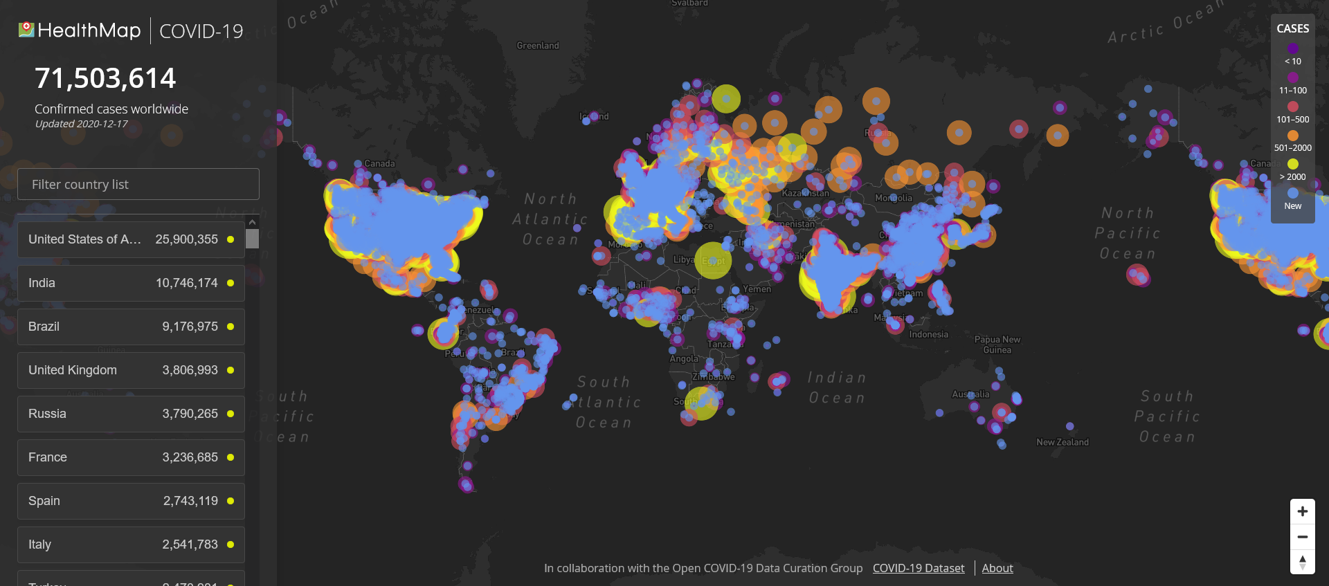
Heat maps show data by using a system of color-coding to represent different values. They can be used to show user behavior on specific webpages. These maps work more visually than standard analytic reports, which can make them easier to analyze at a glance.
Heat maps are best used with large amounts of data. As heat maps show trends, it is important to have enough information to ensure that any anomalies do not affect the overall heat map picture.
Heat maps can take the form of a rectangular chart, the cells of which contain numerical data. Or, more commonly in Earth science applications, heat maps are colors overlaid on a map of Earth.
Three different examples of bad physical and heat maps. The first two examples show physical maps that have unclear values and confusing colors. The third example is a heat map that is displayed on a rectangular chart and lacks proper labeling for the data being represented.