- Tufte Book Report: Visual Explanations, In’s chapter
- Free Form:
Assignment
- Free Form
- Develop an initial prototype of your visualization
- If your prototype is static, commit your mock-ups as a (potentially multipage) PDF called
process/prototype.pdf
- Whether you're building something screen based or simply using Excel & Illustrator to generate your visuals, place your most up-to-date data files in
project/data and name your primary script project/sketch.js
- Whatever form your project takes, the prototype must use real data; this is a first draft, not a pencil sketch! If your dataset is too large to visualize fully in one week, pull out a handful of representative cases and visualize those to show the range of outcomes.
- Tufte Book Report: Visual Explanations, the conclusion
- A Thousand Suns
- Free Form
- Lightning round: report on topics & data sources
- Individual meetings & work in small groups
Assignment
- Free Form
- Select one idea to develop further for your final project and create:
- a one-page proposal,
- three concepts with two sketches apiece,
- a spreadsheet with one or more tabs arranging your collected data into a form you can begin generating charts from.
- See the “Sketches and Data” section of the assignment for details…
- Reading #2: Subtleties of Color
- To actually use your newfound understanding of color, start looking into using chroma.js in your sketches
- Note the use of the
.hex() method to convert from chroma’s color representation to p5’s on line 23 of this example
- If the chroma.js library is too heavyweight for your needs, take a look at my brewer palette generator and see if you find it easier to use. Consult this catalog to find the name of the palette you want.
- A Thousand Suns: initial critique
Assignment
- A Thousand Suns
- Complete your final version and commit your code and documentation in a folder called
3.mapping-quantities/final. If you have designed a static visualization, upload a PDF at the proper scale and trim its art-board to be full-bleed. Your description of the project’s data and visualization approach should be in a file called 3.mapping-quantities/final/README.md.
- Free Form
- Spend an hour brainstorming ten ideas for your final project. Focus on data that seems interesting to you for reasons you might not be able to articulate, then start posing questions that you could potentially answer with that data (either alone or in combination with other information).
- Describe each idea in a sentence or three (ideally ending with a concrete, testable question) in
4.final-project/process/ideas.md (you’ll need to run make update to pull down the template for this file first)
- From your ten ideas, find five data sources on the web and document them in the file
4.final-project/process/datasources.md using the format demonstrated with the USGS example at the top of the file (and be sure to delete this once you've completed your list).
- Tufte Book Report: Envisioning Information & Visual Explanations
- Final project ideas
- A Thousand Suns
- Review your sketches merging an external data set with the testing timeline
- Pick one direction to develop for next week
Assignment
- Read The Subtleties of Color and come to class prepared to answer questions about the ideas within
- Note: We’re taking a break from the Tufte readings and will complete Visual Explanations on April 22nd
- A Thousand Suns
- Develop your initial visualization and commit your code and documentation in the folder called
3.mapping-quantities/project. If you have designed a static visualization, upload a PDF at the proper scale and trim its art-board to be full-bleed.
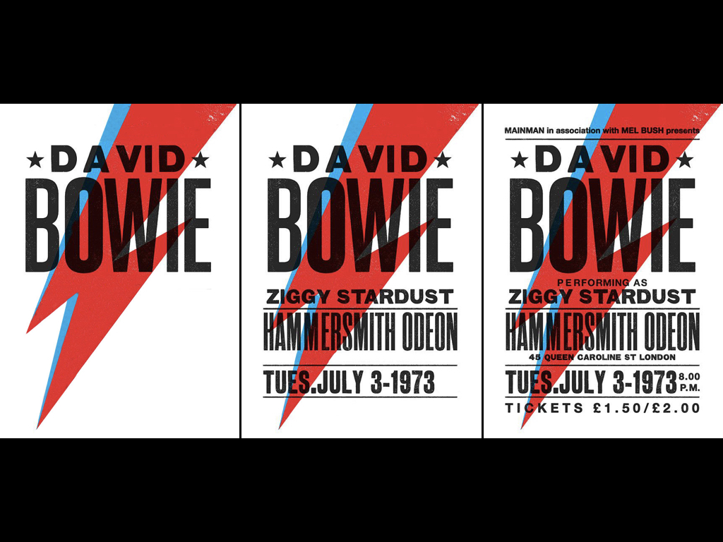
- Fine tune the text and typography surrounding your diagram in order two provide ‘three reads’ in terms of information from headline to body text to legends & labels (similar to the three visual reads we explored in the first assignment).
- Include a brief (just a few sentences) explanation of your project’s data and how it is presented in
3.mapping-quantities/project/README.md
- Tufte Book Report: Envisioning Information (and QDoVI wrap-up)
- A Thousand Suns
- Share possible external data sources
- Examine your exploratory visualizations
- Demo using p5 to plot csv data
- Meet to look over your sketches and discuss merging in the external data
Assignment
- A Thousand Suns
- Clean up whatever spreadsheet manipulation you did to the testing data via pivot tables and the like into a csv-friendly format that has a single header row, 1 set of data per row, and is purely rectangular (i.e., no skipped lines or multi-row/column regions). Save this to a csv in your
project/data folder where your p5 code can access it.
- Find the external data source you’ll be using for your ‘so what’ and ‘compared to what’ variables and convert it to spreadsheet form. If the data is quantitative in nature, do some exploratory visualizations using the spreadsheet. If it is qualitative, use a vector drawing app to organize the information spatially (for example, sorting similar items into groups and assembling a bunch of categorical lists or assigning a date to each item and arranging them into a timeline)
- Bring in three pencil sketches that show different options for merging the testing data with your external data source. As before, save these images to the
process directory and explain their logic within the README.md file.
- Final project
- Make a short list of subjects that might be of interest and do some brainstorming for the kinds of data you’d need to collect to learn more about it
- Tufte Book Report: The Visual Display of Quantitative Information
- Right Twice a Day: final crit
- Exercise 3: A Thousand Suns
- Workshop: a crash course in spreadsheets
- See also: Joel Spolsky's Excel ‘tutorial’
Assignment
- Tufte Book Report #2
- A Thousand Suns:
- Run
make update in your repository folder to fetch the new assignment
- Generate three exploratory visualizations based on the spreadsheet data using either Google Sheets itself or other off-the-shelf tools. Place SVG or PDF exports of these charts (after editing them in Illustrator or Sketch) in the
process folder and sum up the ‘take home message’ of each in a single sentence in the process/README.md file.
- If you decide to work with Google Sheets, take a look at the User's Manual. There are demo videos for most of its functionality.
- In addition, add three pencil sketches to the process folder exploring ways in which you could represent the nuclear testing data without using a map. Focus on what aspects of the data you plan to present, which you will omit, and what needs to be summed, grouped, or averaged in order be most comprehensible.
- Pick an additional data set that you think would make for an interesting counterpoint to the nuclear testing data. Think in particular about addressing the ‘compared to what’ and ‘so what’ sides of the question in a way that either lets us understand the scale of the main data set, or gives us a deeper understanding of the political regimes, technology, culture, social developments, etc. that were going on during the relevant time periods.
- Locate a source on the web for this contextual data set and bring it to class
- Read up on using the
preload() and loadTable() commands in the p5 reference; in combination they will allow you to fetch a CSV file and load it into an object called a Table.
- Try adding some
print() statements to the starter code in the project folder to get a sense of how you can pull values out of the table by row/column coordinates, using the names in the header row, etc.
- Presentation
- Samantha on Otto Neurath
- In on Ben Fry/Fathom
- Programming workshop
- Right Twice a Day: in-class work
- By the end of class have three concepts (including pencil sketches) for a time visualization that includes the hours/minutes/seconds values from your ‘clock’ explorations and at least three ‘calendar’ variables of your own choosing (day of week, month, season, etc.)
- Commit your sketches to the
process folder in a file called hybrid-sketches.pdf by the end of class and detail their logic in the README.md file in that directory.
- Remember to both commit your changes locally and then push them up to github. Make sure that all your work so far is visible when you browse through the files on your github pages in the browser. The course website will update its
/work pages every five minutes with a copy of your repository.
Assignment
- Tufte Book Report #1
- Right Twice a Day
- Incorporate feedback and finalize your three code-based date visualizations
- Develop one of your three ‘hybrid’ calendar + clock concepts in code for your final visualization. As before, duplicate the
project folder and title it final. Once you’ve settled on an idea, rename the folder to something with a descriptive suffix (e.g., final-radial-weekdays).
- Create a
README.md file within that final folder that gives your visualization a proper title and include a brief explanataion of how the 3 clock variables and additional date variables have been encoded into retinal variables for the final visualization. In other words, describe it well enough for someone to make sense of your visualization if you weren’t there to explain it to them
- Note that by next class you should have 7 folders total containing your visualizations from the past several weeks. Make sure the folder names all start with either
clock-#, date-#, or final. For instance:
clock-1-short-titleclock-2-another-short-titleclock-3-yet-another-titledate-1-yadda-yaddadate-2-foo-bar-bazdate-3-etc-etc-and-so-forthfinal-something-something
Assignment
- Right Twice a Day
- Polish and incorporate feedback on your three code-based time visualizations
- Convert your paper sketches into code for your three date visualizations. As before, duplicate the
project folder three times and name them date-1, date-2, and date-3. Once the sketch is complete, rename each folder with a meaningful and descriptive suffix such as date-3-season-colors
- Presentation
- Right Twice a Day
- Review of your clock sketches
- Javascript & P5.js Workshop
Assignment
- Right Twice a Day
- Complete at least three representations of the current time (ignore days, weeks, moons, etc. for now) that develop on your sketches from last week.
- This time everything must be done in code. Use the
clock() function to access different attributes of the current time (a listing of its property names is included in the assignment).
- Make sure each approach addresses hours, minutes, and seconds in such a way that the representation looks different over the course of a day, hour, and minute.
- Start by duplicating your
project folder three times and naming them clock-1, clock-2, and clock-3. Once you've completed each sketch, rename the folder with a more descriptive suffix (e.g., clock-1-radial-seconds)
- Add three new sketches to your
process folder that this time focus on representing at least two of the longer-term calendar variables (and for these you don't need to worry about incorporating the wall-clock time)
- Each sketch should choose two or more calendar values to represent (e.g., day-of-week, day-of-month, month, moon, season, or year) and you should use a different retinal variable for each value (i.e., 6 different retinal variables across the 3 sketches)
- Since calendar units use much more irregular values than clocks do, pay extra attention to the
progress attributes provided by the clock() function and figure out how to map their 0–1 values into an appropriate range to use for drawing
- Discussion of the Kieran Healy intro chapter
- Nothing but a Number: Review of your quantitative, qualitative, and humanistic posters
- Workshop: Git, the course repository, and committing changes
- Create a ‘fork’ of the course repository on GitHub: click on the Fork icon in the upper right to create a personal ‘working copy’ that you can edit
- This will take you to a page whose URL is
https://github.com/YOURNAME/iv-2021; this is the copy you’ll want to work on throughout the semester
- Click the green button that reads ‘clone or download’ and choose the ‘open in desktop’ option; this will open the Github Desktop app and let you choose a location on your laptop for the files
- The Repository menu in the Github Desktop app lets you open the folder in the Finder or in Terminal—do the latter and you should be able to see the top-level contents by typing
ls and see where it lives on your hard drive by typing pwd
- Type
make config into the terminal window; you’ll only have to do this this one time, but it sets up your local copy’s connection to my master copy
- In the future I’ll ask you to type
make update to pull down changes I’ve uploaded. Try this now and hopefully you’ll see a message saying you're up-to-date
- Type
make server to start a local webserver and navigate in the browser to the 2.mapping-time folder. Try poking around in the basics and examples folders and make sure they run correctly. Note that the terminal window where you typed this will start logging the pages you load. When you’re done working, type Control-C in the terminal window to shut down the server.
- Copy your work from the first project (ideally as PDFs) into the proper subdirectories of the
1.single-numbers folder then switch to the Github Desktop app and notice that it’s now listing everything you just copied as 'changed files'
- Type a message into the field in the bottom left corner that says ‘Summary (required)’ then click the blue Commit button
- Edit the
README.md files in each folder itemize the subject(s) and retinal variables you used in the various posters. Try using Markdown syntax to style your text, add links, etc.
- Once you’re done editing, go back to the Github Desktop app and commit those changes too
- Tutorial:
Assignment
- Read the P5.js introductory materials: Getting Started, the Overview, and Color (and take a peek at the Examples section while you're at it).
- Begin Exercise #2: Right Twice a Day
- Complete at least three representations of the current wall-clock time (ignore days, weeks, moons, etc. for now) and document your ideas with text and sketches in the
process folder
- Each of these should consist of a pencil sketch or vector drawing and an explanation of how each value (hour, minute, or second) is being transformed into a particular retinal variable (or a combination of them)
- For each of your three approaches, sketch out what it would look like for the following times:
- 1:15 A.M.
- 1:15 P.M
- 7:45 P.M.
- Explain the logic of each of the sketches in the
process/README.md file
- Extra credit: Take an initial swing at implementing one of your sketches using P5. Duplicate the template
project folder and give it a working title. Then start messing around with its sketch.js file, incorporating what you’ve learned from the tutorials and the demos in the 2.mapping-time/examples folder from the repo.
- Retinal Variable wrap-up
- Meet in pairs, presenting your data-to-retinal variable ‘mappings’ to one another
- Pick one example row from the other person’s worksheet that you feel is particularly successful, surprising, or creative
- Pick one row from your worksheet that you’re unsure of and have a question about
- Present those two rows when we re-join the whole class
- Research & Readings
- Nothing but a Number
- critique of your 7 different experiments
- begin work on next iteration by choosing 1 direction that you’ll approach from 3 different angles: quantitative, qualitative, and humanistic
Assignment
- Poor Form
- Read Kierann Healy’s chapter on ‘badness’ in information graphics. For every reading assignment, you will be expected to post a short (250–500 word) write-up summarizing what you took to be the ‘message’ of the piece, what you agreed or disagreed with, and what you’d be curious to hear your peers’ opinions about. Be sure to add the tag "R1" to your post by clicking on the gear icon at the top of the screen and don’t forget to Publish your draft.
- Nothing but a Number: Final Posters
- Pick one of your directions from this week’s sketches and develop three different posters, expanding on the information graphic at its core, the typographic treatment of its textual content, and a visual hierarchy that allows for ‘three reads’ based on distance/attention.
- Be sure to include your ‘primary’ piece of data—the original number you selected—and any (or all) of the supplemental numbers you came across in last week’s iteration (i.e., the ‘compared to what’ portion of the argument)
- Choose any aspect ratio for each poster, but limit the largest side to 17". Experiment with different sizes on the different posters and consider how your use of composition interacts with those dimensions
- Use a single type family and establish your type hierarchy by varying its size, weight, and/or width
- The textual content should include (at least):
- A short (fewer than a dozen words) title
- A slightly longer (under 3 sentences) ‘lede’ that makes the claim your graphic is there to support
- A short paragraph of ‘discussion’ that explains subtler points being made by your graphic or otherwise provides context for the subject matter you’re engaging with. This is your chance to address the ‘so what’ portion of your argument
- A citation to the source of your data
- The graphic itself should include a legend explaining anything that needs to be established about the meanings of the colors, patterns, sizes, positions, etc. Make sure this is working in harmony with both the graphic and the typographic elements on the page.
- Programming Workshop
- In preparation for next week’s in-class lab, make sure you've got the following installed/set-up:
- a text editor (consider VS Code, SublimeText, or Atom)
- a development environment (on a Mac, install the developer tools by opening the Terminal app and type
xcode-select --install; for Windows I recommend signing up for AWS/Cloud9 then creating a new ‘environment’.
- an account at GitHub and (if you’re not using Cloud 9) a copy of the GitHub Desktop client
- Depending on the extent of your prior experience with programming, you may want to take a look at:
- Catalog & Classify
- Discussion of your findings
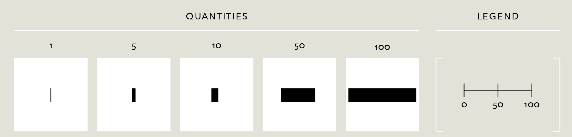
- Exercise: Jacques Bertin and the seven "Retinal Variables"
- Download a copy of this worksheet (it's an Illustrator-friendly PDF)
- Using the vector drawing software of your choice, fill in all the cells of the empty grid you see sprawling before you. Each cell should represent the numerical value denoted by the column using the retinal variable corresponding to its row.
- Note that each retinal variable has two rows devoted to it: construct a distinct 'rule' for how to encode the values for each and try to make them as different from one another as possible
- Off to the side draw a key or legend that would allow a viewer to 'decode' the original number based on its visual representation
- Nothing but a Number
- Get started on our first real project of the semester
Assignment
- Retinal Variables
- Come to class with a Illustrator/Sketch/Figma/etc. version of your worksheet with two variations for each of the retinal variables.
- Export a PNG version and embed it in a blog post using the tag
Retinal Variables. After you publish it, make sure your post is visible here.
- Nothing but a Number
- Each day, find a number of interest and then design a poster for it in one hour or less. Add a new heading to your blog post identifying the day of the week and upload a JPEG or PNG of your poster. Be sure to document the source of the information in the image’s caption and include a link.
- Come to class in next week with all seven of your posters in a single PDF, ready to be screen-shared.
- Sign-in
- Assessment of student skills, levels, and interests
- What do you want to learn in this class?
- What sorts of data/information graphics work have you done previously?
- Any coding or stats experience?
- Introduction to course goals and expectations
- Intro talk
- Exercise: Catalog & Classify
- Create and publish a new post with your visualization type as its title. Assign it the tag “Catalog & Classify” in the gear menu.
- Describe your chosen visualization type in terms of the kinds of values it represents (e.g., fractions, integers, percentages, etc.) and the sorts of comparisons it enables or discourages.
- Explain what types of calculations need to occur to go from the raw data to the ink/pixels in the resultant chart (for instance, do you need to add up all the values then plot them based on their proportion of the whole? or find the minimum and maximum value to establish the endpoints of an axis?)
- Explain the ‘mapping’ by which numerical/categorical/etc values are converted into positions, sizes, colors, textures, etc. If the chart is primarily about using size to show values (as in, say, a bar chart), can it still use other features such as color to communicate other pieces of information? How?
- Search the web for examples of your chart type in use. Include 3 images demonstrating ‘good’ uses and 3 more with ‘bad’ uses of this visualization type. Add a caption to each image describing what makes it good or bad.
- Consult the Ghost Editor Overview to help you format your text & images.
Assignment
- Catalog & Classify
- Complete your post about your chosen visualization type and be prepared to talk about it next time